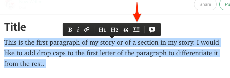
In the early 2010s, when I was a post-grad (not a professional), I started writing online. And my first blog was on Medium.com. And the writing experience there was excellent.
I think that was one of my earliest "a website can do that?!" moments. I don't want to forget that feeling.
The buttery spacious experience of writing and laying out your piece felt like what every WYSIWYG editor should want to be. The words looked beautiful and it did Just Work™️. It wasn't clunky buttons, and impossible-to-escape-or-indent lists (looking at you Notion and JIRA).
It's like the first time you smell fresh cookies coming out of the oven, or watch someone make music up close, or witness someone really use photoshop.
It's one step before "I think I could make something like this".
And it was a website. A website that didn't have Google money or Google brains. A website that wasn't just plain forms and tables.
Medium might have tried to scale too far and fumbled the monetisation, discoverability, and editorial aspects. I might have left Medium and taken a hard stance on markdown as the One True Format. But that text editor was really fucking cool, and I hope all the folks who imagined that product into my browser in 2014 knew that.

Everything written here, on my personal blog, is just that: personal. Nothing here reflects, or is endorsed by, my current or previous employers.