Figma recently introduced Variants - a way of extending and varying your components. Components in Figma, and in modern web development, are reusable and encapsulated elements of a design - with the classic examples of a Button or a Card.
Variants add new flexibility, and utility, to components in Figma by introducing properties and values to them in a programmatic way. If you have experience writing modern web applications, these variants and properties are like a specific subset of props which you pass to a component. I say subset, because some things will still need to be manually edited within an instance of a component - like the text in a card. Other things, like a "variant" or "type" be be edited (e.g. info, danger, or primary) which in turn could switch the accent colour, and the icon used (from an i, to an alert, to a logo). Think about all the common variations of a component you make for different use cases - variants are a way to define those before you come to use them.
Variants were released relatively recently, and I think they're cool. While they require more conscious work to create, they make it much easier to compose a mockup or design using an existing design system. Additionally, the need to create a set of names for both your properties, and their possible values, forces you to develop a verbal language around your design.
In this piece I'm going to give five examples of where variants have helped me, in the last couple of weeks. I'm not going to use the Button component as an example - because that's a tired workhorse, and I'm definitely a bit sick of it.
Component Examples
Don't bury the lead, here are some components to show how variants in Figma can be used. None of the are Buttons (did I mention that?), but they are all components I've used in the past couple of weeks. Where I didn't make the component myself I've linked out to the original author.
I've standardised on Variant as a property name for a generic "type", "context", "kind", or "variety" in components. This is the same language as Material UI uses to describe this property and variation. I personally don't like to use Type - because it's already a word loaded with meaning in typed language. Context also has a meaning in React. Naming these kinds of properties is hard, but you have to stay consistent.
Shoutout to UI Guideline for providing inspiration and starting points.
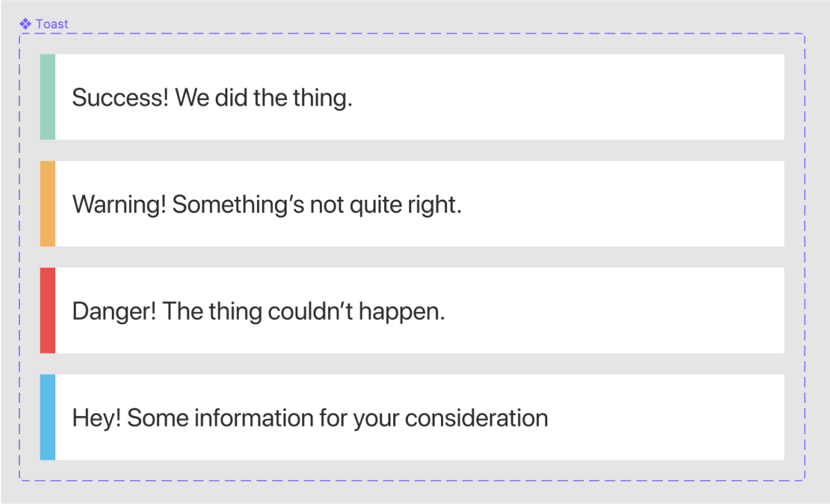
#1: Toast
Toasts are those little alerts that pop up or down into a screen with a transient messages. Often you want to vary the accent colour, or icon, depending on the context of the message. There's only one property here (Cariant) which controls this accent colour.
Variant: success, warning, danger, info
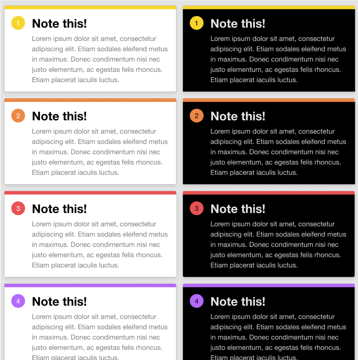
#2: Note or comment
Eduard Giménez released a set of comment components into the Figma Community. The Note This file contains a set of sticky-note-like component which teams can use to annotate their designs in Figma.
Eduard has used two properties on his variants: Color, which describes the accent colour of the icon and top of the note, and Dark which is a boolean for if the note should be in a dark mode.
Color: Yellow, Peach, Coral, etc.Dark: true, false
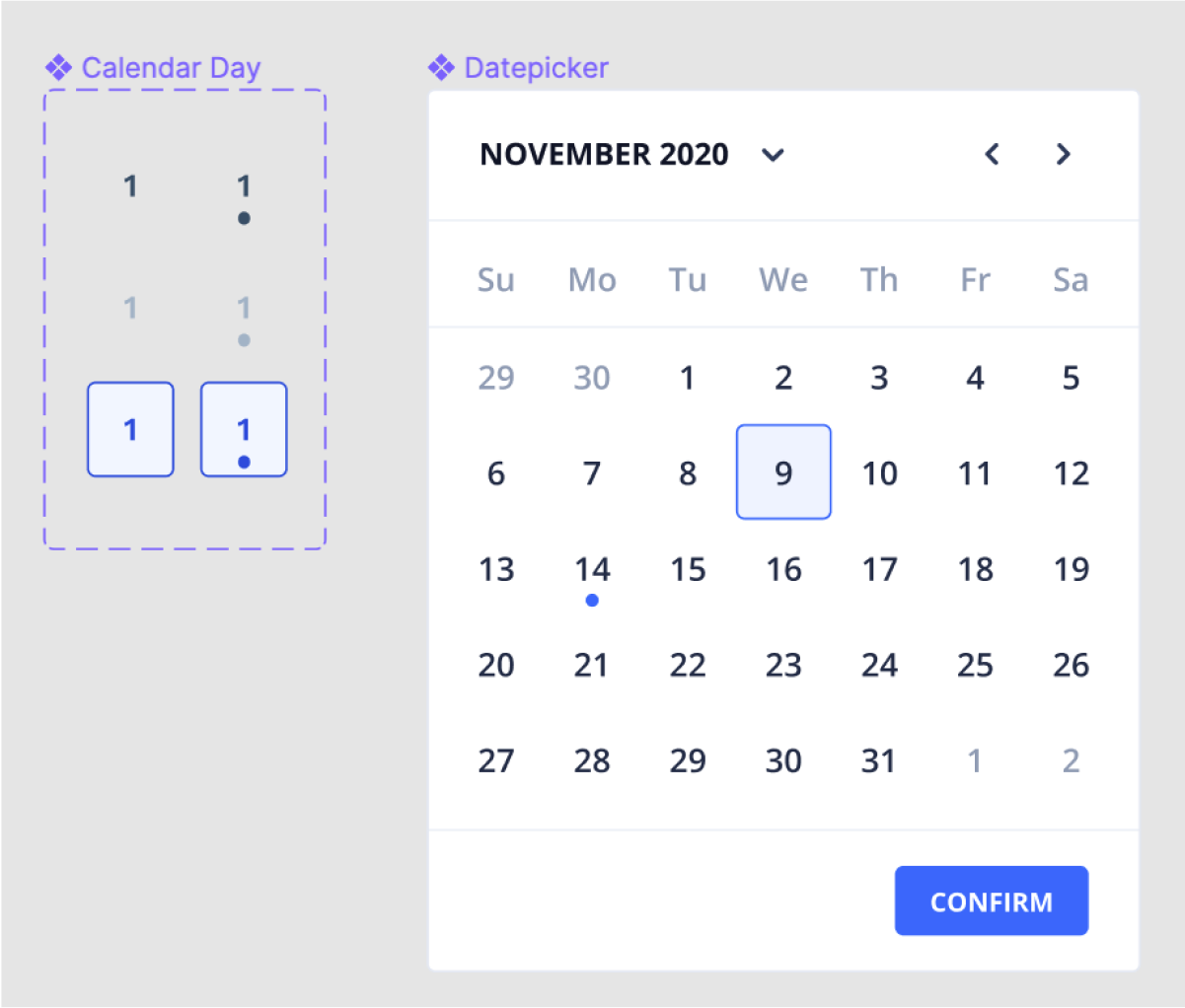
#3: Calendar Day
I've recently been using the Eva Design System as the starting point for a design language. As part of this, I've been working with calendars and date pickers - which have turned out to be a classic example of hidden complexity.
Calendar days represent a single day within a week or month view, often used in the date-picker component.
Eva broke them down across three properties, each a boolean flag:
Selected: true, false. Used to show if the day has been selected by the user (or by default), and is indicated with the box surrounding the day.Has events: true, false. Indicates if there are additional details, events, or context on a specific day. Visually this is represented by the small dot underneath the number.Disabled: true, false. Let the user know that the day cannot be selected or clicked. Visually greys out the day and reduces contrast between background, border, and content.
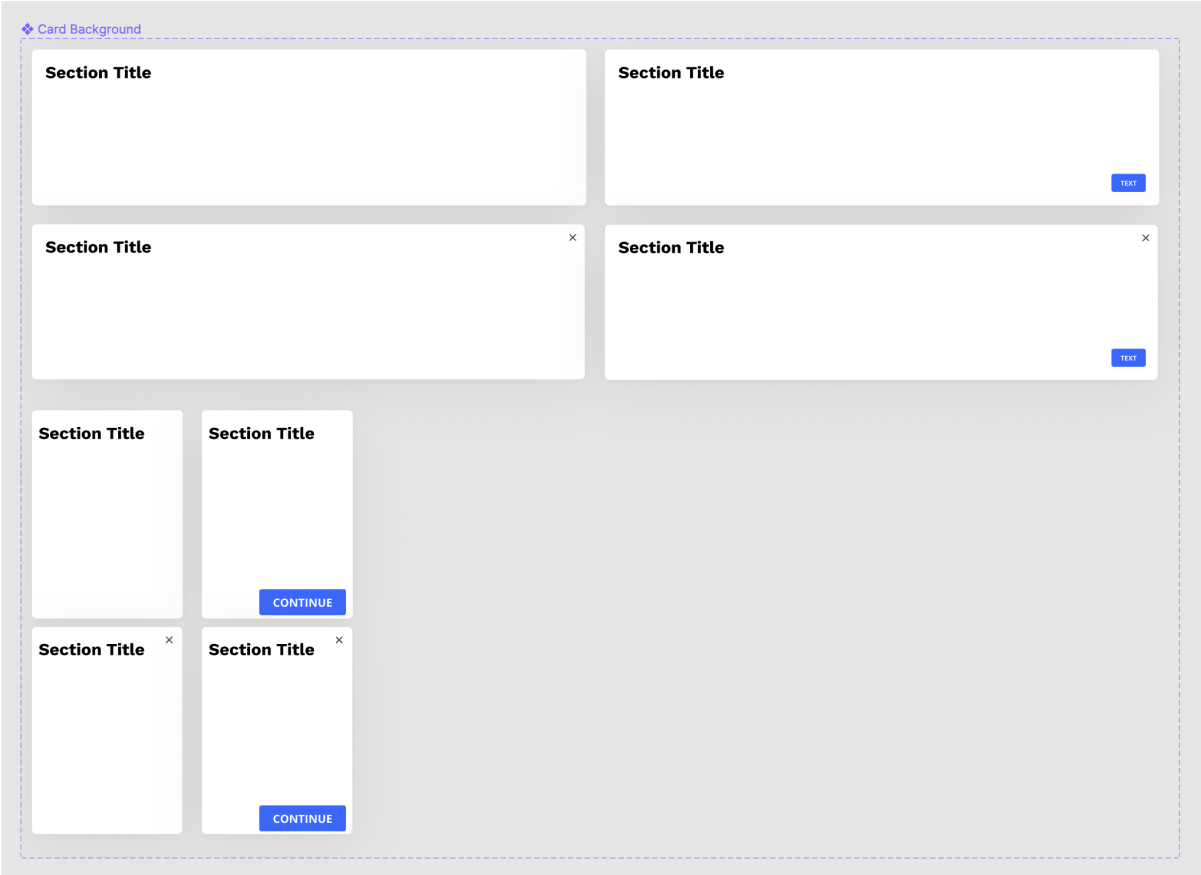
#4: Card or Modal
I've been building a number of screens and modals recently (as part of my design work at Oxwash), and Variants have let me use a common component as the background on each of these instances.
The Card component typically represents the background and container for some content, e.g. a product in a product list. A Modal, however, is normally overlaid on the screen, as if it had a higher Z axis value (i.e. it pops out of the screen). Visually they are very similar, but conceptually they are quite different.
I found by adding or removing an icon in the top-right (e.g. to close a modal) - both were pretty much identical.
Platform: mobile, desktop. Depending on the size of the viewport, you may wish to change padding, but also reduce/increase the size of touch targets.With Button: true, false. Place a button in the bottom right of the card, for a primary action.With Close Button: true, false. Place an icon in the top right of the card which acts as a touch target to close a modal.
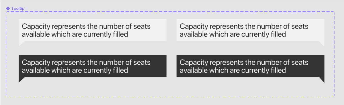
#5: Tooltip
I've also been using Tooltips at Oxwash - tooltips are little containers of text that appear on hover (or tap, for mobile) to offer some additional information.
Technically, tooltips are quite complex, but in terms of design I've kept them simple, with just a couple of properties:
Colour: light, dark. To switch between a global light or dark mode UI.Anchor Position: bottom left, bottom right, etc. Which indicates where the little speech bubble anchor appears on the tooltip.
Wait, couldn't Figma do that before?
Erm, yeah, sorta? Previously you could use naming conventions of components to help organise related components and then swap them out with siblings/cousins/grandparents. You did this with the naming conventions of the component, e.g. you could organise your three different types of alert component by calling them:
alert/warningalert/infoalert/success
This works when you've only got a couple of variations of a component. Specifically it works when your components only vary along one dimension, e.g. the accent colour of the alert. What happens when we have a couple of aspects the component can vary by? What if we want different components for mobile, for dark mode, for actionable alerts (e.g. with a button or link)?
All we've got is a single string, so we absolutely have to i) maintain strict naming conventions of both the possible values of a property, and ii) identical order of properties in those strings. For example, the following components both parse well to a human, but would be structured very differently within figma:
alert/mobile/warning/dark/withButtonalert/dark/noButton/warning/mobile
This would make it hard to swap components out with the related ones. Figma essentially creates a directory, or folder, -esque structure so these kinds of inconsistencies eventually force you to move around a lot, or do a lot of searching. This will also make your components less discoverable, which is essential if you're a design team who shares Figma files to a wider organisation.
Also it's just messy. I don't like non-productive mess.
Properties I have found useful
There are a couple of properties I have found myself reaching for, and finding useful - especially when you're trying to work out all the fiddly details in a specific design. These include:
- Variant: Inspired by the material UI naming convention, this covers the possible contexts the component can appear in (
info,danger,warning,success). - Platform: If you're designing the same screen across platforms and viewports you may need to adjust touch targets and font sizes (
mobile,tablet,desktop) - Errored: If you're dealing with fields, forms, or processes - it's useful to know how we display a failure state and the related info (
trueorfalse) - Disabled: Useful if you're trying to show a certain form state is invalid, most commonly applied to Buttons (
trueorfalse) - Authenticated status: Who is the current user and what is their relationship to the page/component? Sometimes we want to show/hide certain actions depending on the authentication or authorisation status (
user,admin, orno-user)