UX design resists standardisation or templates. It can't be a one-size-fits-all approach, and the nature of the product, audience, and production team all mean that something different is needed each time. Whenever I get past the early stages of UX design (like understanding what a product does, and who it does it for) - I find myself with a different working document and process than I've needed before.
I wanted to share the things I do that give me the momentum to get to a place where I can do this more specific kind of document.
I am a very visual person, so this starts with low-fidelity UI mockups: clunky boxes and text, that I can setup and tear down quickly. My process is built around forcing me to move through all the parts of an app quickly. This means I force myself to encounter all the information an app needs,every way that it's displayed, and everything a user can do with it. Seeing these things within a short time makes repetition and patterns more obvious - and helps me make connections and similarities.
Tl;dr
- You are going to make a list of all the Screens & Components in your app. You're going to do it in an ugly-ass looking document that you're never going to share and actively should not spend time to make pretty. Make this document however makes sense for you - Figma, Sketch, Paper, whiteboard, plaintext, WHATEVER I DON'T CARE AND NOR SHOULD YOU - YOU'RE NEVER GOING TO SHARE IT
- First, make a list of all the Screens in your app, and lay them out (roughly, don't fiddle with arrows) in an order that someone could realistically move through your app. I like to group similar screens closely together, and I also look for common screen patterns (e.g. screen with a header and a footer nav).
- You're going to make a note of all the high level Components on the screens. Start by just making a boring old box with really clear terms on it: e.g. "Account Details", "Sign in form", "Create account form", "Recent transactions".
- Go through these high level components and start making the low level, more abstract/utility ones: "TextField", "Button", "Icon", "Label". And begin to compose these together in your higher level components.But do not lay them out nicely.
- Take your Screens and Components, and list all the variants in State that you can have: can a TextField be
selectedordisabled? Can an event in a calendar beupcomingorpassed? Can the Screen for editing an article be ineditmode orreadmode ? - You're going to look at all the components you have that are Actions - i.e. can I click it, slide it, interact with it in a way that does something: navigates me somewhere, opens a modal, logs me out. Use this as a chance to understand all the ways a user can navigate around the app - going from one screen to another.
- Look at all this amazing information you have about your app or product, and how you can organise it to help your team design and build a product in a way that creates the most value most quickly.
Why even do UX?
I mean, honestly, if you don't think it will serve you, your product, or your team, don't do it. Don't invest in work uncritically, if you don't see how it ultimately makes you more money or a better product. If you think what I'm saying is dumb, don't listen or read - I think plenty of people have useless opinions, especially on the internet.
For clarity, when I talk about UX design, I am talking broadly at developing an understanding of an app or service from the end-user's perspective. How will they interpret the thing we put in front of them, and what can a design/engineering team to do make sure that the creative vision is the same as the user's experience?
It's like viewing a miniature model of a town: you can see distinct regions, connections between them, and kinds of buildings in each. But you don't get bogged down in the specifics, like "is that store a pharmacy or a grocery store?".
More concretely, this understanding is useful in making a product that actually does what you want it to. It's no good having an app that does something "in theory" - because truly most of your users don't care about "in theory". They want to learn a another language, make a claim on their insurance, or get a new beautiful handmade scarf. This is similar to the Jobs to be Done mentality.
From an engineering perspective, as someone who makes apps, doing UX design helps break a "simple" app into exactly how many things need to be built, and what they need to do. It lets me build the necessary things, in a sensible order, and gives me a shared language/understanding that then lets me communicate effectively with a team.
0: Screens & Components, State & Actions
Everything I do in this early UX process is designed to help me understand my app along four heuristics: Screens, Components, State, and Actions. These are the things that I find it useful to break an app into - they might be useless to you and that's okay. Do read on, and see what sticks.
- Screens - these are easy to intuitively grasp but hard to define. Assuming prior knowledge of the internet: they're like URLs of a website, which will take you to a specific page, like a profile, sign-up form, or edition of a newsletter. More abstractly, they're discrete, separate views into an application which are containers of other content (i.e. Components).
- Components - are also really hard to define - they're visual things on the screen. The ReactJS docs calls them "independent, reusable pieces, [that let you] think about each piece in isolation". The most commonly thrown-around example of components are Buttons or Cards - they're just reusable bits of UI, that can be really small (like a button) or larger (like a log-in form).
- State - is a way of modelling what information/data the app will store, it usually affects what will be displayed or how it will appear. For example, what's the name of the current logged-in order, what are the details of the current search/filter being set by the user?
- Actions - are the things a user can do on a screen, what can they press, swipe, toggle, move, type into, etc. The consequences of these actions can be things like opening a modal (a Component, by the way) or navigating to a new Screen .
You are creating a low-fidelity working document.
To help identify these things, we're going to make a visual representation of each. At the early stage on the UX design process I have to remind myself often that I am creating a working document - one that won't be shared widely (or at all) within my team, let alone outside of it. This is just a way for me to organise my thinking. This isn't about making any kind of mockup that looks pretty, or crafting meaningful naming conventions.
Your working document will probably be ugly. Mine definitely are. I have intentionally put ugly images / mockups in this article so you can feel better about how bad yours look and how little you want to share them. Anything you create during this process is meant to serve you, not Dribbble or Instagram. Embrace the brutality and Spartan utility of your UX diagrams.
Trying to optimise for visual and semantic consistency at this stage makes you feel busy, without having to address the important questions. So long as I know what a component or screen means, then it doesn't matter.
I also really encourage you to work with pencil and paper next to you. Even if you're prototyping on paper - have more paper ready just to jot down questions, sketches, ideas as they arise to your brain. You can't go chasing down every rabbit hole - it will break your flow, and I really think it's important to build up a good flow, in this process. This flowcess. But you also don't want to lose any legitimate ideas or questions you have, they can help you a lot when you're doing higher-fidelity design.
Oh my plants
In this article I'll be using the example of an app that helps you keep track of all of your houseplants. I've called it "all my plants" and I've given it a very predictable green theme.
1: Identify Screens
So let's imagine the following user journey in oh my plants - I want to get to a page that has a whole bunch of details about a specific herb. I can get there by searching for it, by seeing it in a list of plants I've said I own, and perhaps by an automatically created list of plants (like what's in season). This gives us five screens: starting at Home we can end up at Plant Details by going through either of the three possible routes.
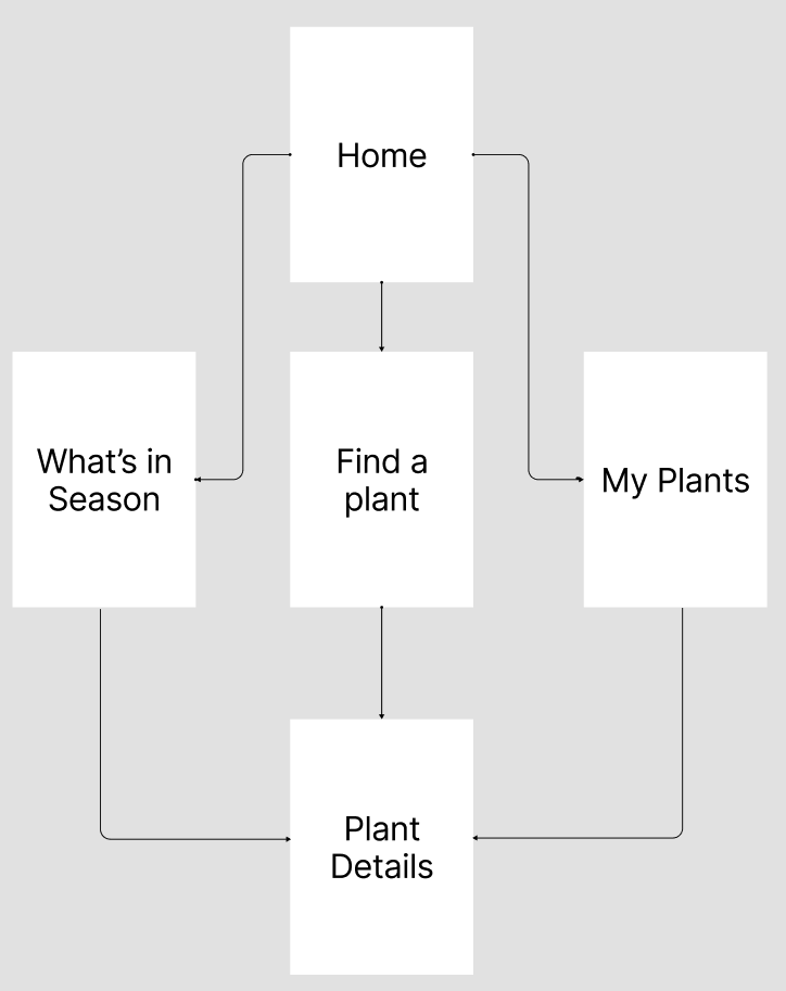
This kind of layout, with the arrows drawn between them, is useful at some points, but it's exactly the kind of over-optimisation I just warned against. Because what happens if I need to add in a new screen or remove one? I have to re-structure all of the positions and arrow flow.
Robust software architecture is about fighting rigidity and letting developers change individual parts quickly - because requirements are always changing. Good UX design can learn from this - build a working document is about rapid change - the tool you use should work as close to the speed of your thought process as possible so that one isn't lagging behind the other.
I'll end up with something like this: simply a list of screens, in some semblance of order that make sense to me. In Figma I make each of these into its own Component (or Symbol in Sketch) so that when I begin fleshing out user journeys later on (like the pretty arrow diagram above) - we'll see something less abstract than just white boxes and black text to represent a screen.
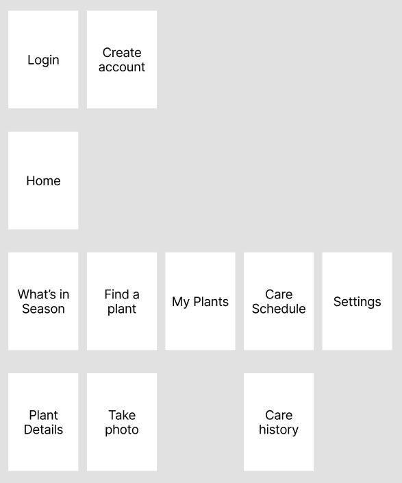
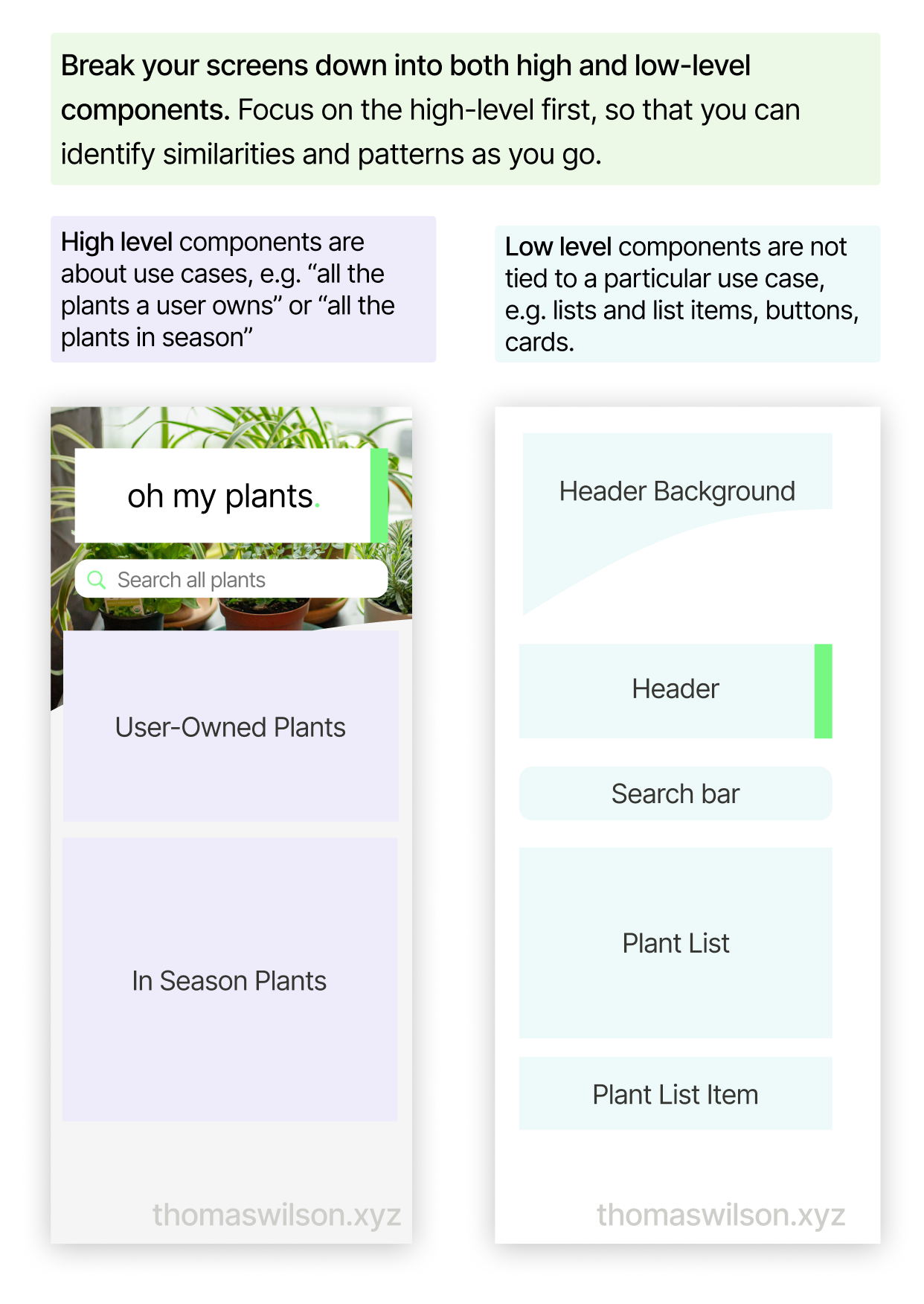
2: Identify the Components
Once you've got all the screens, start going one-level deeper by identifying Components - distinct bits of UI. I find it most useful to start with the high-level components - i.e. Start with high-level components - things driven by their use cases. I name these in very opinionated ways: "User Owned Plants" is a list of plants the user has said they one, and "In Season Plants" might be a list of plants that are ripe for planting.
After I've done that, I start identifying the lower level components: things which are not so closely tied to specific use cases. Prime examples are Lists and List Items, as well as Buttons or Cards. Use your own discretion and opinions here: is a SearchBar component distinct from a TextField - or should they be the same thing? I would advise leaning towards how you communicate things to the user: do you want them to conceptualise a search bar as the same thing as a field in a form? For me, I would keep them as different components, but I could very easily see it argued either way.
3: Identify State
With your new list of screens and components, you're going to want to go through and make a note of every possible variant based on state.
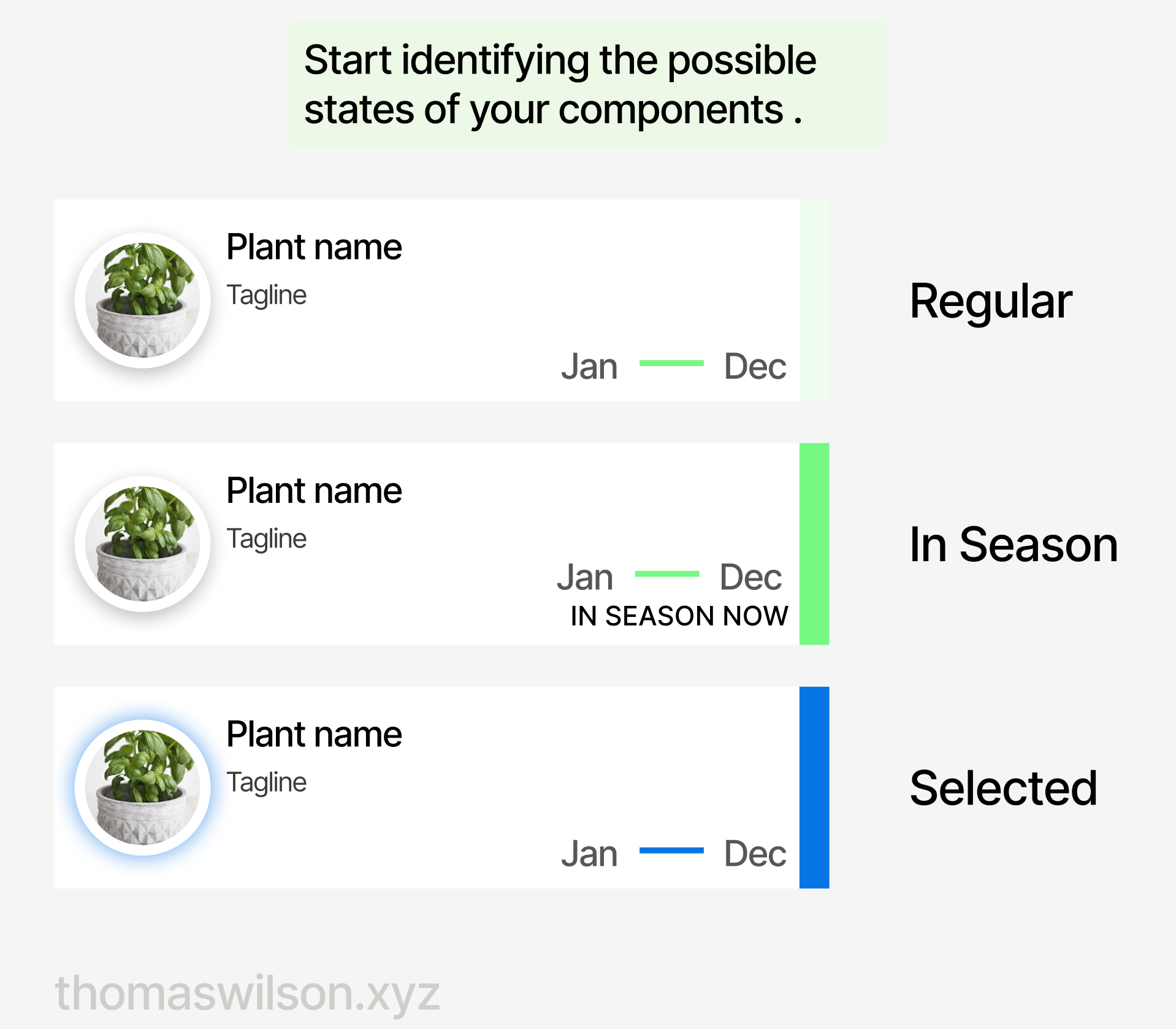
This is when things start to get a little complex/tedious, because it can massively increase the sheer number of screens and components that it looks like you're going to have to design. It's also worth paying attention here to the kinds of State - chances are there aren't that many discrete ones, and they can come in groups and are conceptually related: selected/disabled, read-only/edit, locked/available, active/not-active.
When it comes to the actual design, you'll be able to share visual metaphors here. In fact I would suggest that kind of consistency can make complex business logic or states feel much more simple than their implementation details. If things are disabled/inactive/locked, for example, the result in very similar to a user: there's a thing on the screen that I can't interact with right now.
Wait, why do I need state on my components AND screens?
Yeah, this is a very fine line - and totally is a matter of opinion. This is one of the points that makes product and UX design a skilled profession.
For me, it comes back to what I said at the beginning: UX is about understanding how the user will perceive the product. Even if the information we're presenting is correct, it's the way it's presented that makes the difference between a good and a great experience.
Enough talk, let's give an example. Imagine oh my plants knows when's the perfect time to plant each garden herb. It has a PlantList screen - which is a simple list view of PlantListItems.
A PlantListItem represents one individual plant - which is the thing that's in season. Following that logic, we want to flag each plant as in "in season".
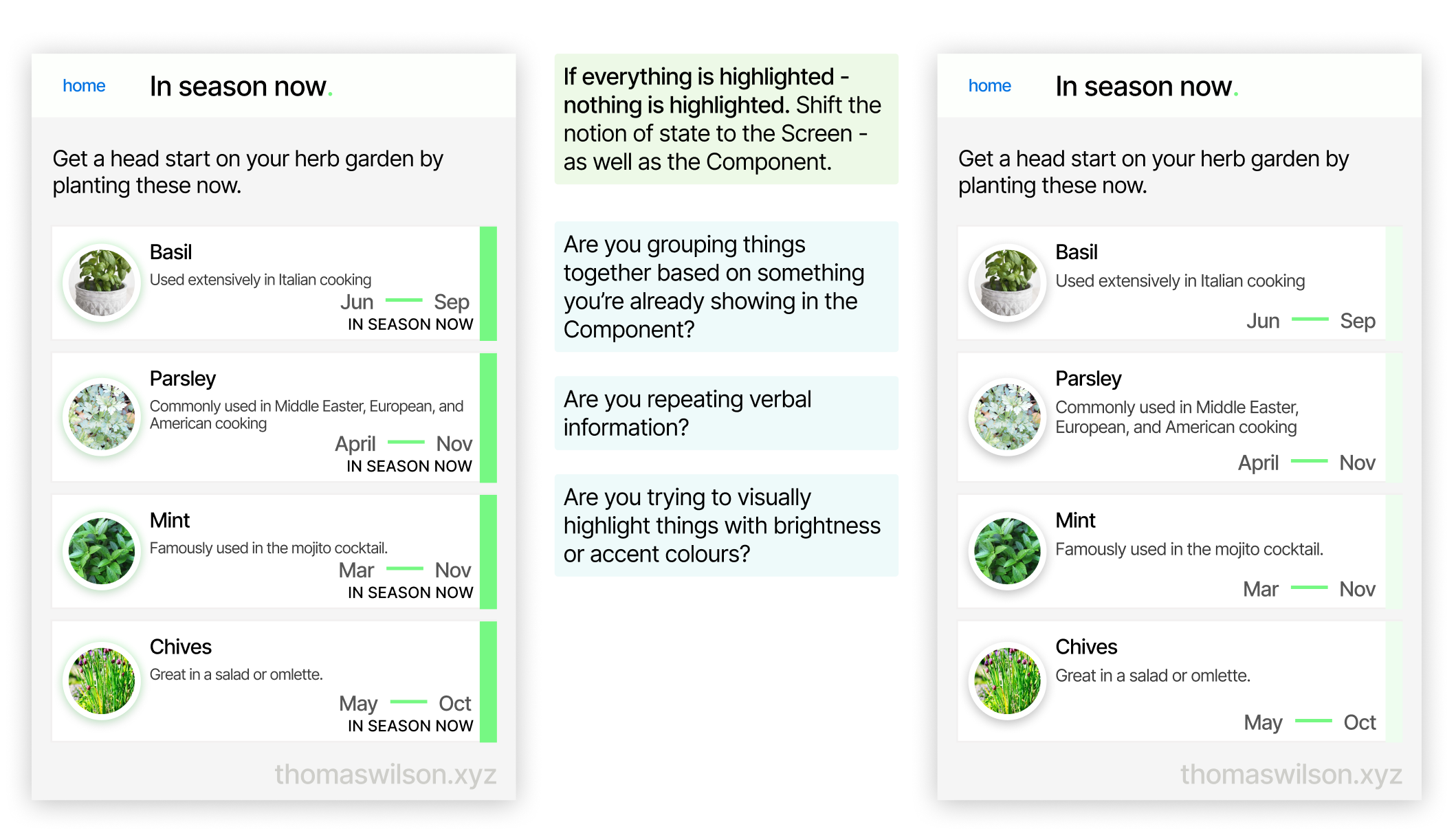
In practice, however, the fact that all the plants are highlighted means that none of the plants are highlighted. It also just looks weird and cluttered and busy. Instead, what if the PlantList was highlighted with some special way of saying that it is in-season?
4: Identify Actions
An action is normally something that changes the state of a component or screen, or that navigates the user around the app.
If you identify actions at this point in the design process, it should be really easy for you. It's probably anything that uses a component like button or select or switch or tab... you get the idea.
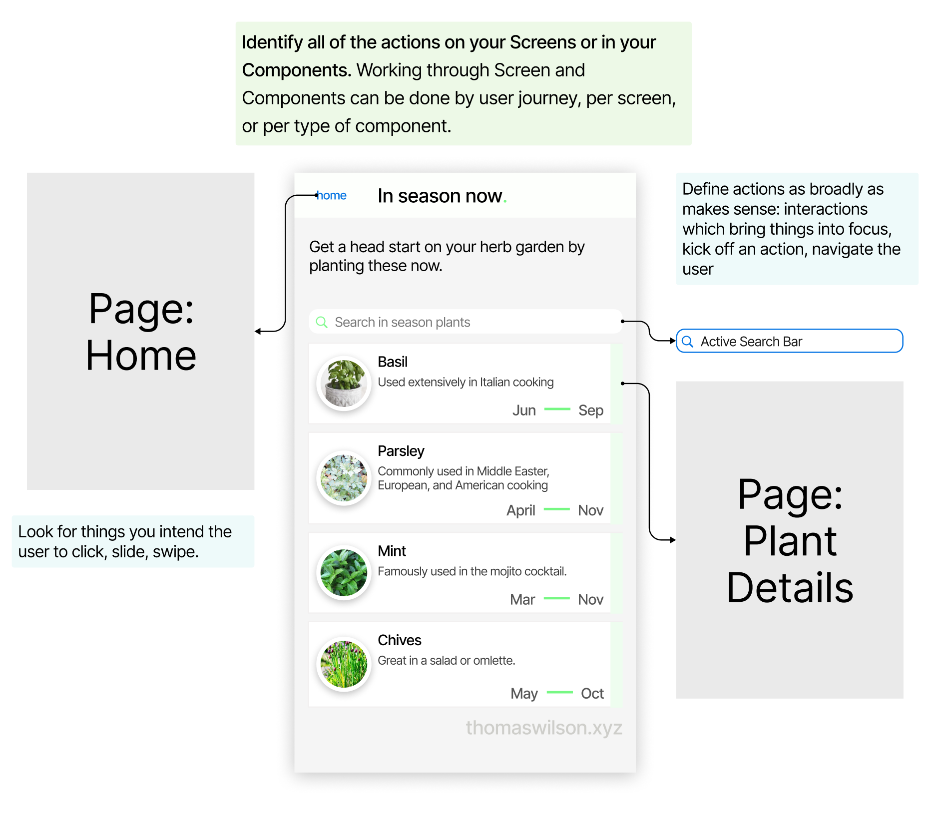
Conversely, if you recognise there are actions that are triggered by clicking non-typical components, like undecorated text or header - then maybe these are interaction patterns you need to make discoverable to your users.
What's considered "typical" depends on the conventions of the platform, e.g. long-press and double-tap on mobile don't really have equals on the web.
5: Go forth
Look, you made it all this way, congrats because even I struggled to make it this far down when I was proof-reading. Hopefully at some point along this journey you've thought "wait, why am I doing this next bit, surely I should go off and do something else instead" - then good. Go do that other thing, like thinking about adding new features or, even better, removing others, or making clearer visual metaphors or condensing many metaphors into one.
You've hopefully got a much more complete and accurate (read: big and scary) picture of your product: all the things it needs to do, what you need to build, and exactly how many designs you've got to flesh out and then build. Or throw over the wall to the developers and hear them argue over for the next 2-9 months.
Take this blueprint forward and make something you're proud of, or ignore my opinions and become successful anyway - I truly do not mind.
Everything written here, on my personal blog, is just that: personal. Nothing here reflects, or is endorsed by, my current or previous employers.